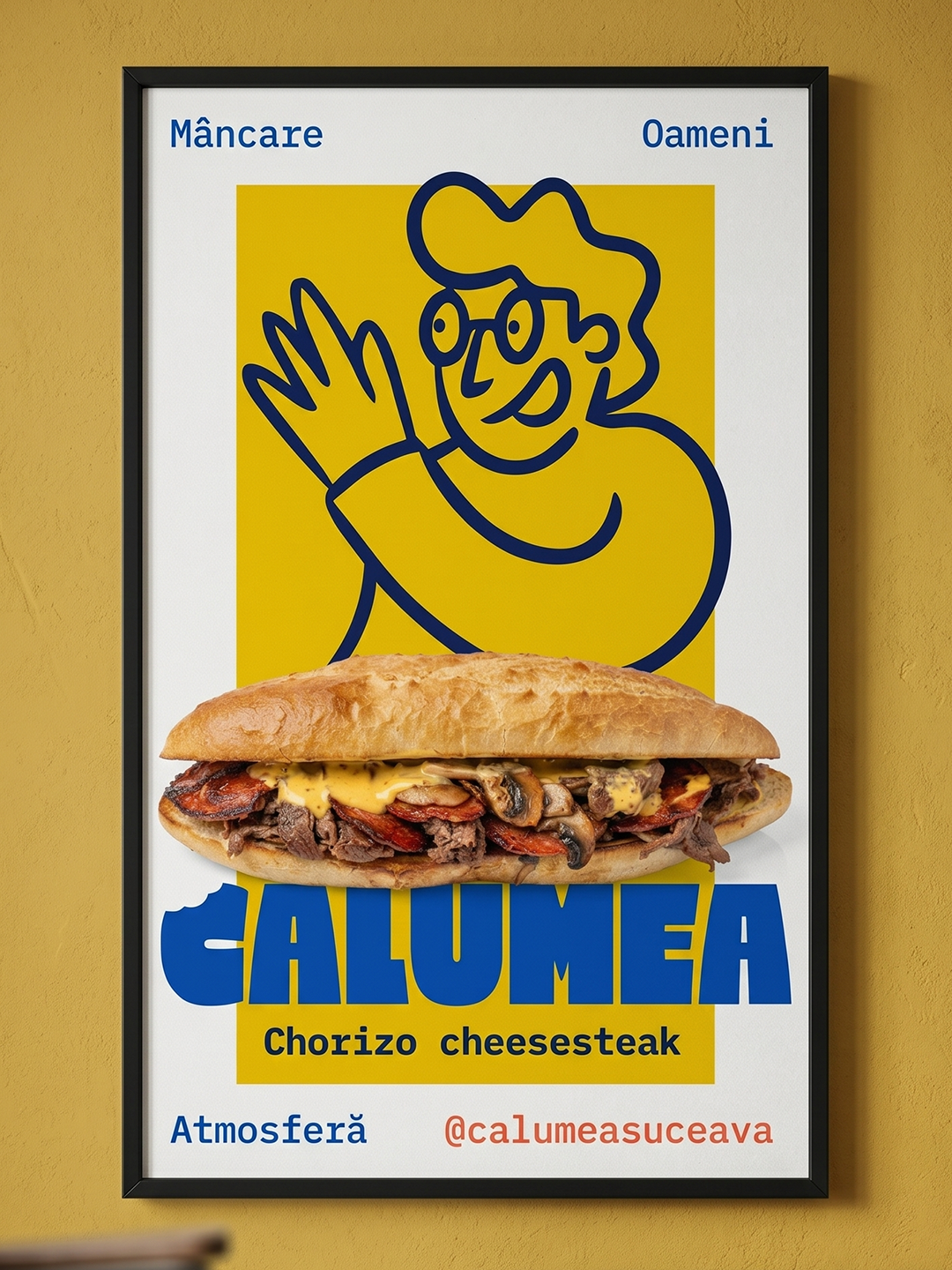

Calumea: Suceava, Romania — 2025
Industry: HoReCa — fast food restaurant
Project type: New brand — concept, strategy, identity, environmental branding
Deliverables: Concept, naming, tagline, brand strategy, visual identity, environmental branding, physical and digital menu, product photography

Project team: Strategy & Creative direction: Antoanela Sandu /// Art direction: David Stroe /// Photography: polisemic.studio
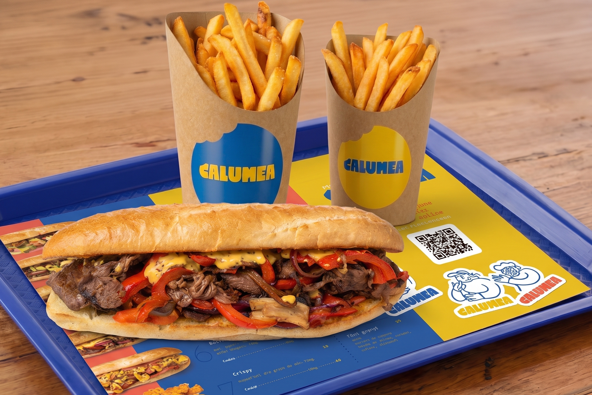
Calumea is a fast food restaurant project opened in spring 2025 in the central area of Suceava municipality.
At the time of launch, the menu offered six variants of philly cheesesteak—a dish with no direct competition in the city—and the medium-term plan anticipated expansion to other dishes.
The client approached us with the feeling that they already had the concept: a restaurant built around the philly cheesesteak sandwich—menu, name, identity, and space, all anchored in a single product. In the first discussion, the goal of the collaboration seemed clear: to visually translate a direction the client had already outlined.
Challenge
The strategic decisions in the early phases of the project rested on two mutually supportive pillars: our accumulated experience and expertise in the HoReCa sector, and rigorous research of the Suceava market.
The research provided us with the raw material—the competitive landscape, the dynamics of the locations, and recent market shifts. Our experience and expertise allowed us to interpret it in context: to recognize patterns, connect seemingly unrelated data, and identify real opportunities.
Approx. 150 competitive locations
In the market study, we identified between 100 and 150 active HoReCa locations in Suceava and its immediate vicinity—an approximate number, as some locations close, others open, and concepts change overnight.
The numbers alone told one story. Our experience read something else: in such an unpredictable context, a brand rigidly built around a single product is a structural risk, not a positioning decision.
Menus, business models, and consumer preferences are dynamic; a brand-label for a single dish would have forced an almost complete overhaul with every offer adjustment.
The second decision came naturally: a light, playful, and relatable concept—a place where three things matter equally, not just the food, but also the people who come and the atmosphere they create together.
Naming
With the positioning clear, we entered the naming process looking for a word that would be easy for people to say—a name that functions as a framework, not as a label for a product. It had to be bold enough to stand out but relaxed enough to be effortlessly uttered.
We arrived at “Calumea”
A playful name with a warm sound, which doesn't tell you what you will eat, but how you will feel. The people are calumea (cool/great), the food is calumea, the whole mood is calumea — the name describes a state, not a product. This gave it exactly the versatility the brand needed: tomorrow it can accommodate another dish, another menu direction, another season, without losing its coherence.
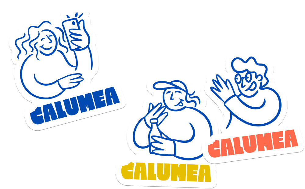
The tagline came naturally based on the strategic foundation. Food. People. Atmosphere. — Calumea. Three words that explicitly state what the place actually sells: not just the plate, but the ecosystem around it. The tagline anchors the name in concrete terms and conveys, without explaining, that this place is not limited to its menu.
Visual identity
With the strategic foundation set, we moved on to visual expression. The central decision was not to fit into the visual language already dominant in Suceava. The restaurant concept remains fast food, regardless of what dishes enter the menu, and in this area, the local market gravitates between two extremes: aggressive American street food aesthetics or a classic, cautious register. We chose to go with something bold, but one that communicates belonging, not shouting.
For the color palette, we chose yellow and blue—a rare combination in the local HoReCa sector, where red and orange dominate. Yellow brings warmth, energy, and the natural appetite of a fast-food brand. Electric blue, placed alongside it, changes the register: it brings confidence and a contemporary air. Attraction and trust, in a single color pair—the combination works precisely because it is atypical in the category and makes the brand easily recognizable on the street, on the menu, or in social media.
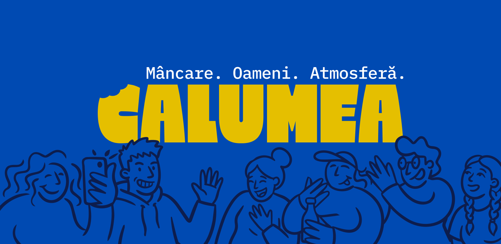
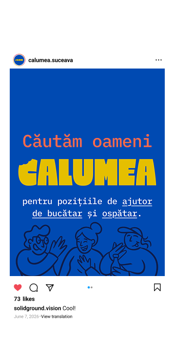
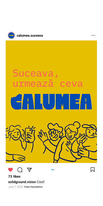
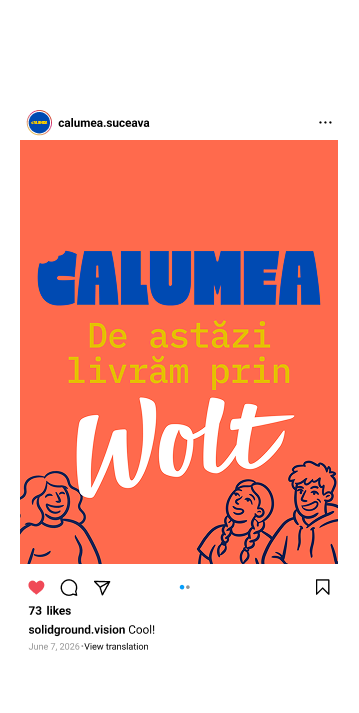
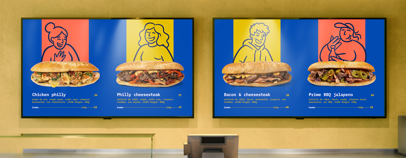
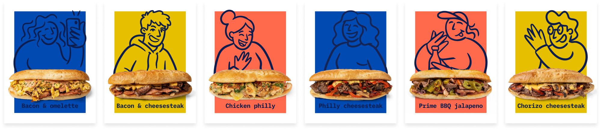
The idea that structured the entire visual territory was community. We created a set of characters that populate the brand identity—faces that appear in materials, on the menu, in the space—and which convey that Calumea is a place of people, not just a point of sale. At launch, the menu had six variants of philly cheesesteak, so we built six characters, each associated with a sandwich. Food was no longer a list of products, but a gallery of characters.
For this project, the biggest challenge came from the budget and time. With limited resources, we chose to move the creative effort where it produced the most—in the concept and the system—so that the identity could be expanded, replicated, and changed over time without major investments.
Environmental branding
We chose a warm, welcoming direction, with the yellow of the main palette applied to the walls—a color that is not found in the local HoReCa landscape and that supports the playful nature of the brand without falling into the ridiculous. The major design decision, however, was one of system, not palette: we needed a way for the space to be able to convey different messages over time—promotions, seasons, new products—without being physically reconfigured every time.
Our contribution to the physical space was one of the most important decisions of the project. When we started the collaboration, the client had a general vision of the space, because there was no clear concept yet to guide it.
The experience and skills of the project designer allowed us to think together with the client, step by step, a good part of the interior design.
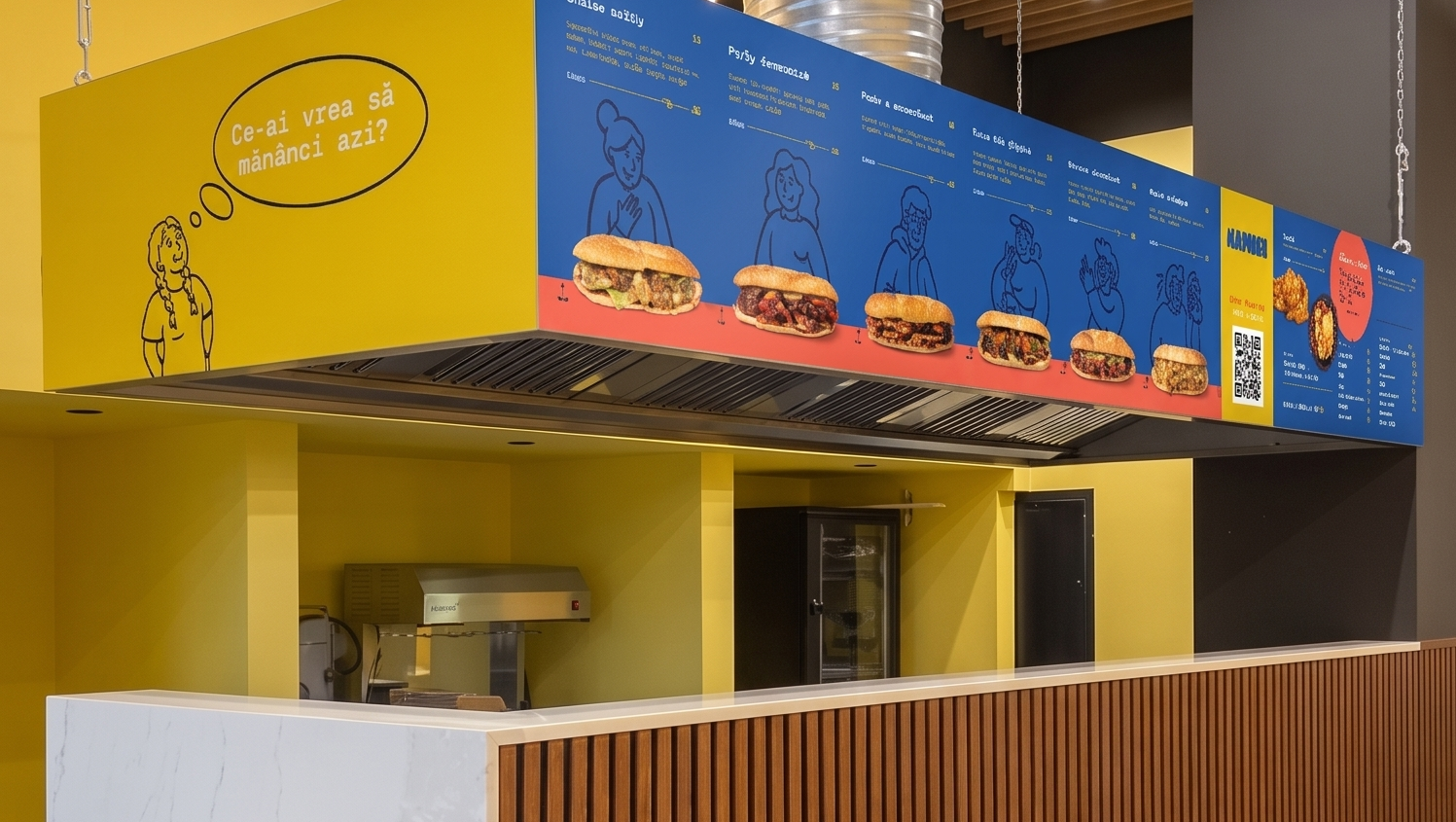
The second challenge was time. The implementation of the environmental branding had to fit into a short deadline, and the modular system we built helped to respect this calendar without visual compromises.
The answer was a set of frames fixed to the walls, thought of as modular supports. The content of the frames changes periodically, and they also function as supports for placing products in the space. The space effectively becomes a brand that updates itself—a decision with direct operational implications, not just aesthetic ones.
Results
We were with the client until the moment of launch. Calumea launched as a fresh brand for Suceava, a project that breaks the classic patterns of the local market and which was noticed exactly for this difference.
The most relevant test of the strategic foundation, however, came after the launch, already without our direct involvement. The client changed the menu once, and the concept we built allowed the transition without identity constraints: the name remained relevant, the tagline continued to accurately describe what is happening in the location, and the system did not need interventions.
This confirms the initial decision. Calumea had to be a framework, not a label for a single product.
For us, the project was a creative challenge with a small budget, and the value of the solutions we found is now measured in the client's operational freedom.